NebloAI — Freight, brokered.
Making AI assistance useful inside real freight operations — not beside them.
Product flows and dashboard experiences for an AI freight platform — helping brokers, carriers, and admins manage search, offers, negotiation, and visibility without losing the thread between them. Screens from my Figma files, shown with dummy data.
NebloAI at a glance.
An AI freight platform that started as a tool for brokers and became a dispatch co-pilot for trucking carriers.
Three roles working the same freight data, each needing a very different slice of it.
Search, offers, negotiation, and tracking had to read as one continuous flow.
End-to-end design ownership from first structure to dev-ready Figma files.
A shared model for how AI, operations, and roles fit together — and screens that hold up in development.
Three roles, two surfaces, one moving feature set
NebloAI started as an AI tool for freight brokers and became a dispatch co-pilot for trucking carriers. It combines AI that works inside email and the chats brokers and carriers already use with dashboards for teams running freight operations end to end. Brokers search loads and negotiate offers, carriers respond and track assignments, and admins need operational visibility across everything.
All of it happened under fast-moving startup constraints: priorities shifted week to week, engineering capacity was limited, and design had to keep the product coherent while the feature set was still being discovered. That meant favoring clear, reusable patterns over one-off screens from the start.
- 01Output trust — brokers must tell system fact from model suggestion before money moves.
- 02Human review — every AI proposal needs a clear approve, edit, or dismiss path.
- 03Uncertainty states — matches and rate suggestions carry confidence the UI has to show honestly.
- 04Input design — vague broker asks need structure before the model can match loads well.
- 05Workflow integration — assistance has to land inside search, offers, and tracking, not in a side chat.
- 06Automation boundaries — what AI may draft versus what only a broker may commit had to be explicit.
The real problem was workflow clarity.
A broker's day is a constant loop of searching loads, comparing offers, messaging carriers, monitoring statuses, and making quick pricing decisions. Every step carries money and time pressure — a missed update means a lost load. NebloAI's premise is that AI can absorb a large share of that operational load: matching, drafting offers, flagging risks.
But without a clear product structure, AI features drift into becoming a disconnected chatbot bolted onto the side of the real work. Brokers will not switch tools to talk to a bot; they switch tools when the whole workflow gets faster. Every AI suggestion had to land next to the decision it supports.
Orientation speed
A broker scanning the board is asking what changed and what needs me now. The early structure made that a row-by-row read.
Information density
Lanes, rates, statuses, carrier history, and AI output all competed at equal weight, with nothing leading the eye to the next action.
Handoff clarity
Engineering was building from loose screens without state definitions, so every new feature reopened structural debates.
The design surface was mine, end to end
As the only designer on a team with a PM and frontend, backend, AI/ML and QA engineers, I owned the flows and screens from first structure to Figma handoff, working in short loops while the feature set was still moving.
- 01Designed dashboard and workflow concepts
- 02Structured broker and carrier-facing experiences
- 03Worked on admin and operational visibility patterns
- 04Designed the chat-based workflows that run alongside the web app
- 05Designed flows for search, offers, negotiation, and operational management
- 06Defined AI interaction patterns — suggestion, review, and dismissal
- 07Prepared Figma designs for product and development discussions
- 08Every screen here comes from my Figma files, with dummy data in place of customer records
Mapping the broker loop before redesigning
Before any screens, I mapped the broker loop end to end. Two stretches stood out as the friction core: comparing offers and holding negotiation state — exactly where the AI layer had to earn its place.
Six ways freight resists clean UI
Making AI useful inside operational workflows
AI suggestions had to appear at the moment of decision (inside search, offers, and tracking), not in a separate chat tab brokers would ignore.
Supporting multiple user roles
Brokers, carriers, and admins share the same freight data but need different views, permissions, and default actions from every screen.
Broker search and carrier interaction as one flow
Search results, carrier outreach, and offer threads had to feel like one continuous flow instead of three separate tools.
Making offer and negotiation states clear
Sent, countered, accepted, expired — every offer state had to be readable at a glance, because a stale state costs real money.
Handling dashboard density without overwhelm
Freight data is inherently dense. The dashboard had to surface what needs action now and let everything else recede.
Scalable patterns for future broker integrations
New load boards and broker integrations were on the roadmap, so core modules had to work as templates, not bespoke screens.
Five decisions that shaped the product.
Each decision came out of a concrete workflow problem, not a visual preference, and each one changed how the screens are structured.
Separate operational visibility from AI assistance
Early concepts mixed AI messages into the same surface as live load data, so brokers could not tell system fact from model suggestion.
A two-layer model: the operations layer is always the source of truth (loads, offers, statuses), while AI assistance lives in a clearly framed copilot layer that reads from it and proposes actions back. Suggestions are always labeled, always dismissible, and never overwrite an operational state on their own.
A wrong read on a load status is expensive. Trust in the AI layer starts with never letting it be confused with the record.
Keep load and offer status highly visible
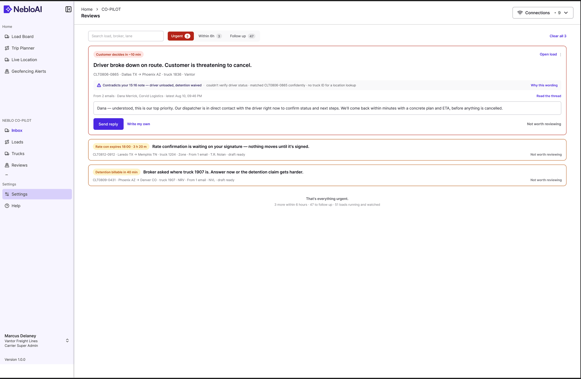
Statuses were buried in detail views and free text, forcing brokers to open every row to answer the only question that matters: what changed, and what needs me now?
Every load row carries a status pill in a fixed column, states follow one consistent taxonomy across broker, carrier, and admin views, and rows that need action sort to the top.
The board became scannable in seconds instead of a row-by-row read — and a stale state stopped hiding among live ones.
Make negotiation flows action-oriented
Counter-offers arrived as plain messages. The broker had to read, decide, switch context, and type — four steps where competitors need one.
Every negotiation event ships with its next actions attached: accept, counter with a suggested number, or decline — right on the thread. The AI drafts the counter from lane data, but the broker always makes the call with one click.
Negotiation is where brokers live or die on speed. Reading and acting became the same moment.
Use dashboard cards for quick scanning
Admins and team leads check the health of the whole operation between other tasks. A wall of tables answers detailed questions but fails the ten-second check-in that happens twenty times a day.
The admin dashboard leads with a card layer — a small set of KPI cards and a volume chart that answer "is today normal?" before any table appears. Cards drill into the dense views underneath.
Density stayed available on demand rather than by default, so the frequent check-in got fast without losing depth.
Create reusable patterns for broker integrations
The roadmap pointed at more load sources and broker integrations. Per-integration screen designs would fragment the product within months and cost a full design cycle each time.
One module anatomy (header, lane, rate, status pill, action row) that every load source renders into, no matter where the data comes from.
New integrations became a data-mapping task instead of a design project, and brokers learn the pattern once.
"We separated seeing the operation from asking about it."
Design principle — NebloAIThe carrier portal, restructured.
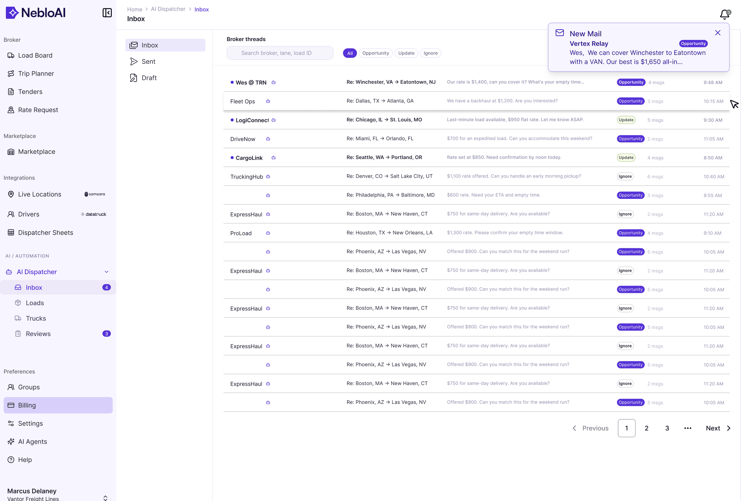
The carrier-facing portal is where the difference is easiest to see: the early state put everything on one screen with equal weight, while the redesign leads with status and a single clear action per load.
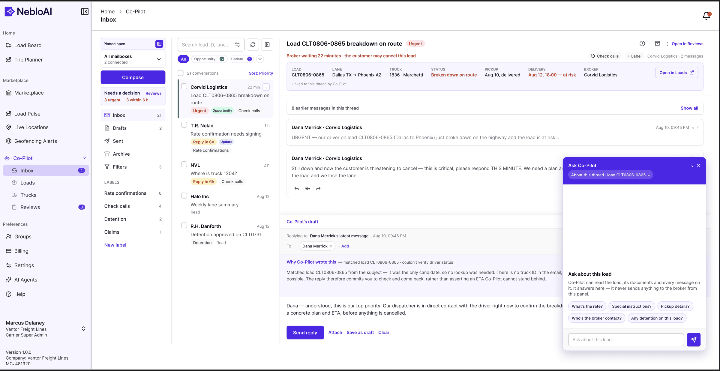
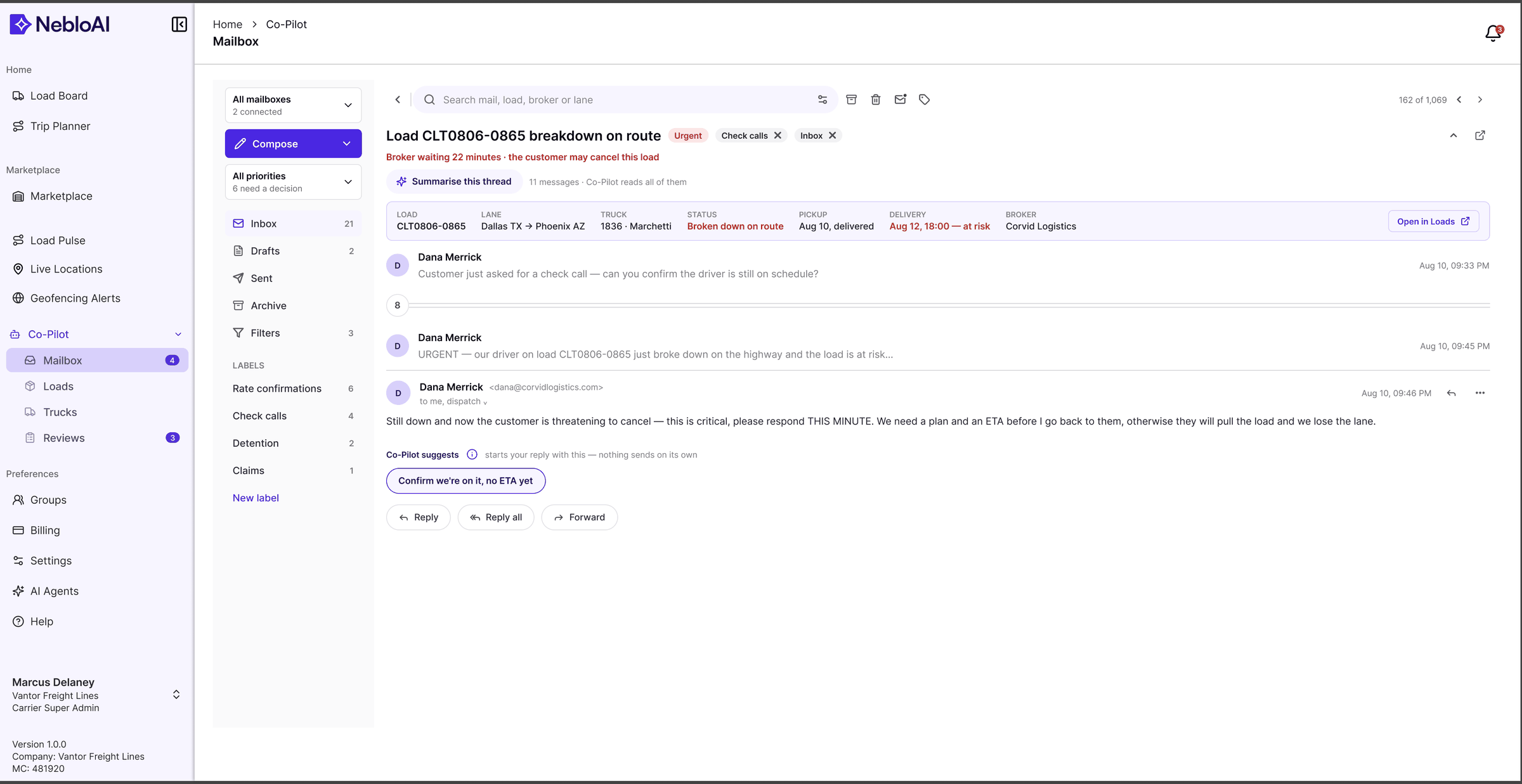
Every thread looked equally important, so triage happened in the dispatcher's head. Rate, lane and deadline were all buried in the same grey preview line.
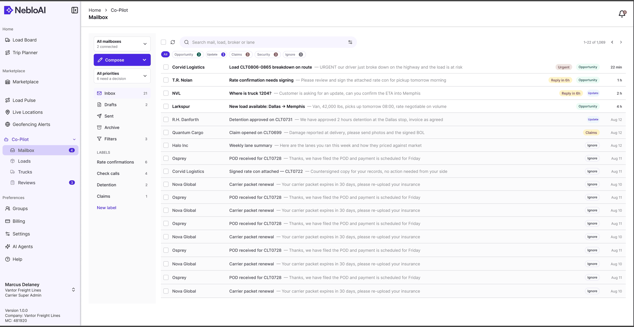
The list keeps its familiar shape, but urgency is now a property of the row (Urgent, Reply in 6h), and categories and labels let a whole class of mail be dealt with at once.
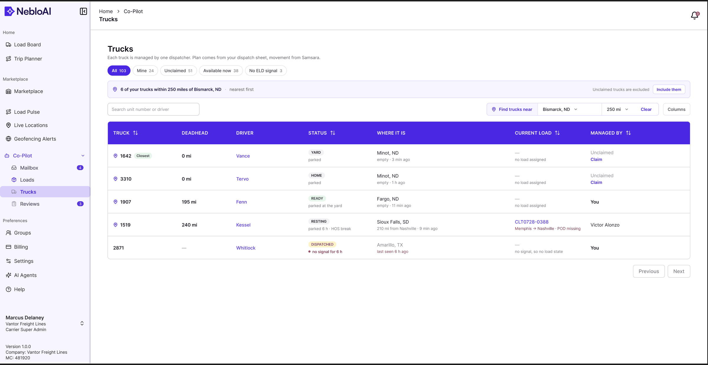
Core screens, shown with dummy data
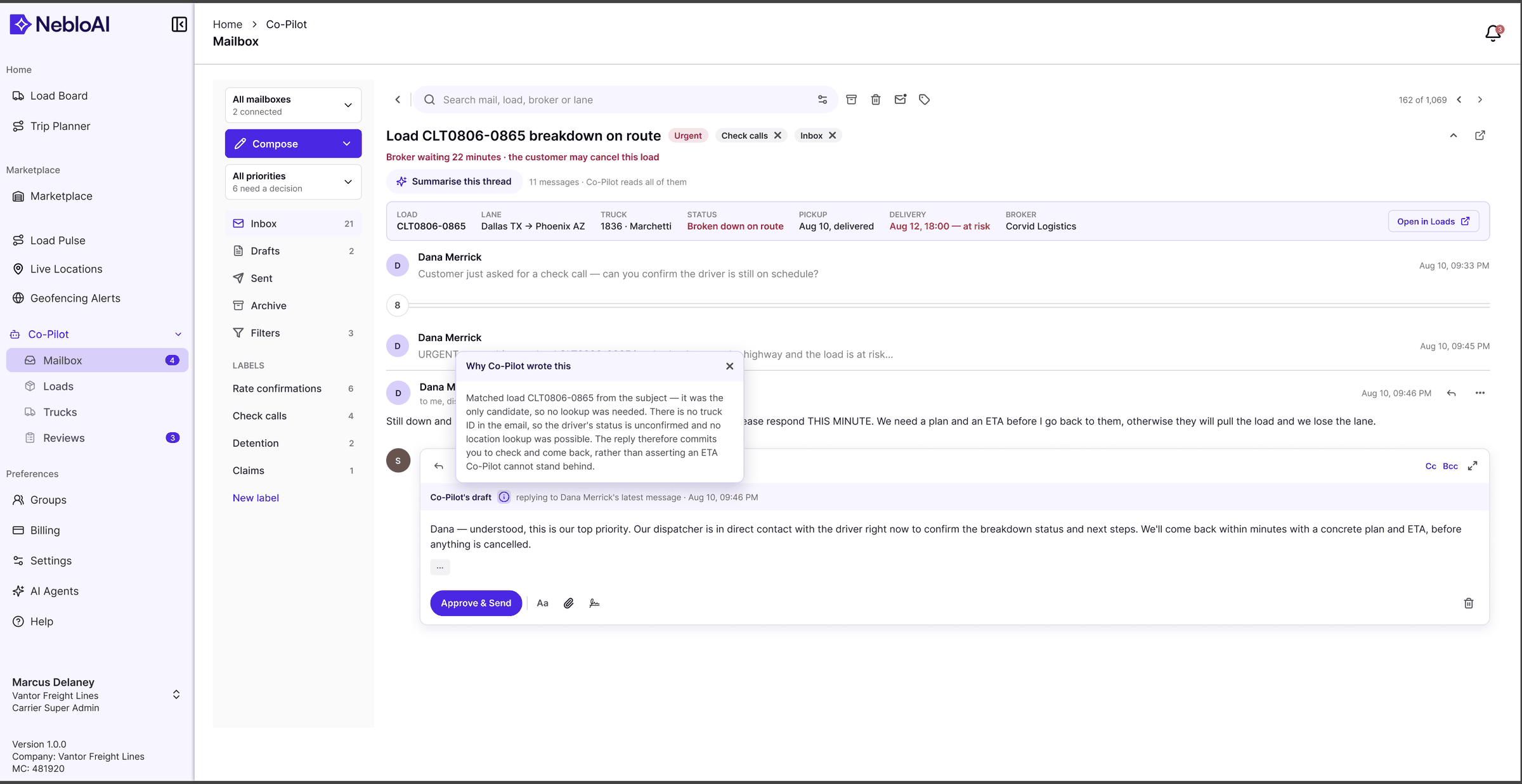
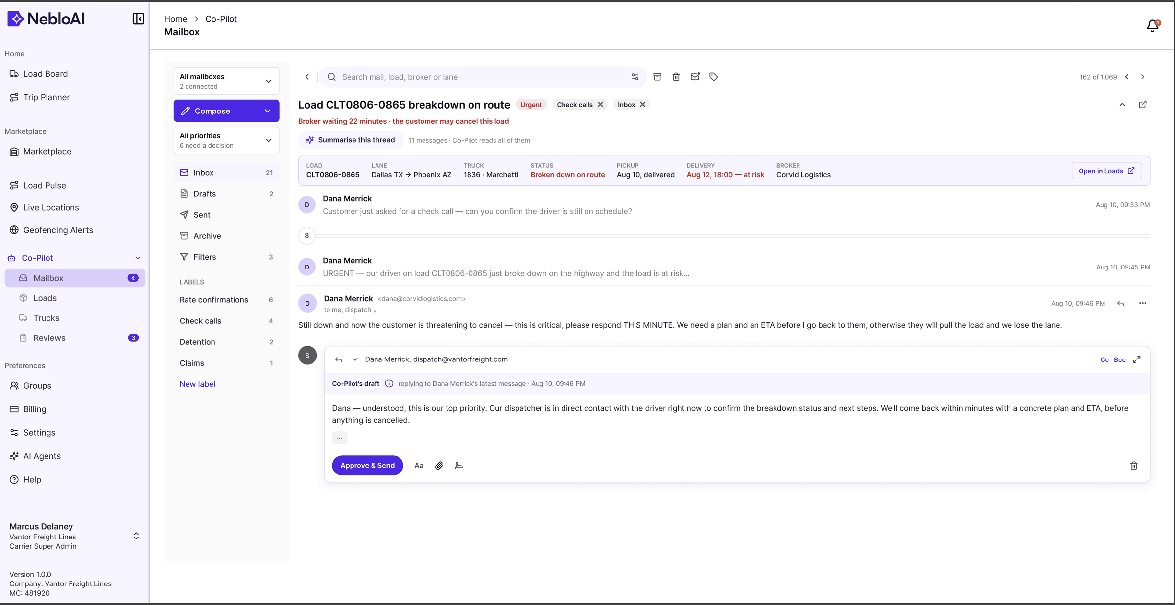
What the screens are built from.
I owned NebloAI's design system from v1 to v3. The screens use a shadcn base kit plus Neblo's own tokens and components, and every value in this section is read from the Figma file.
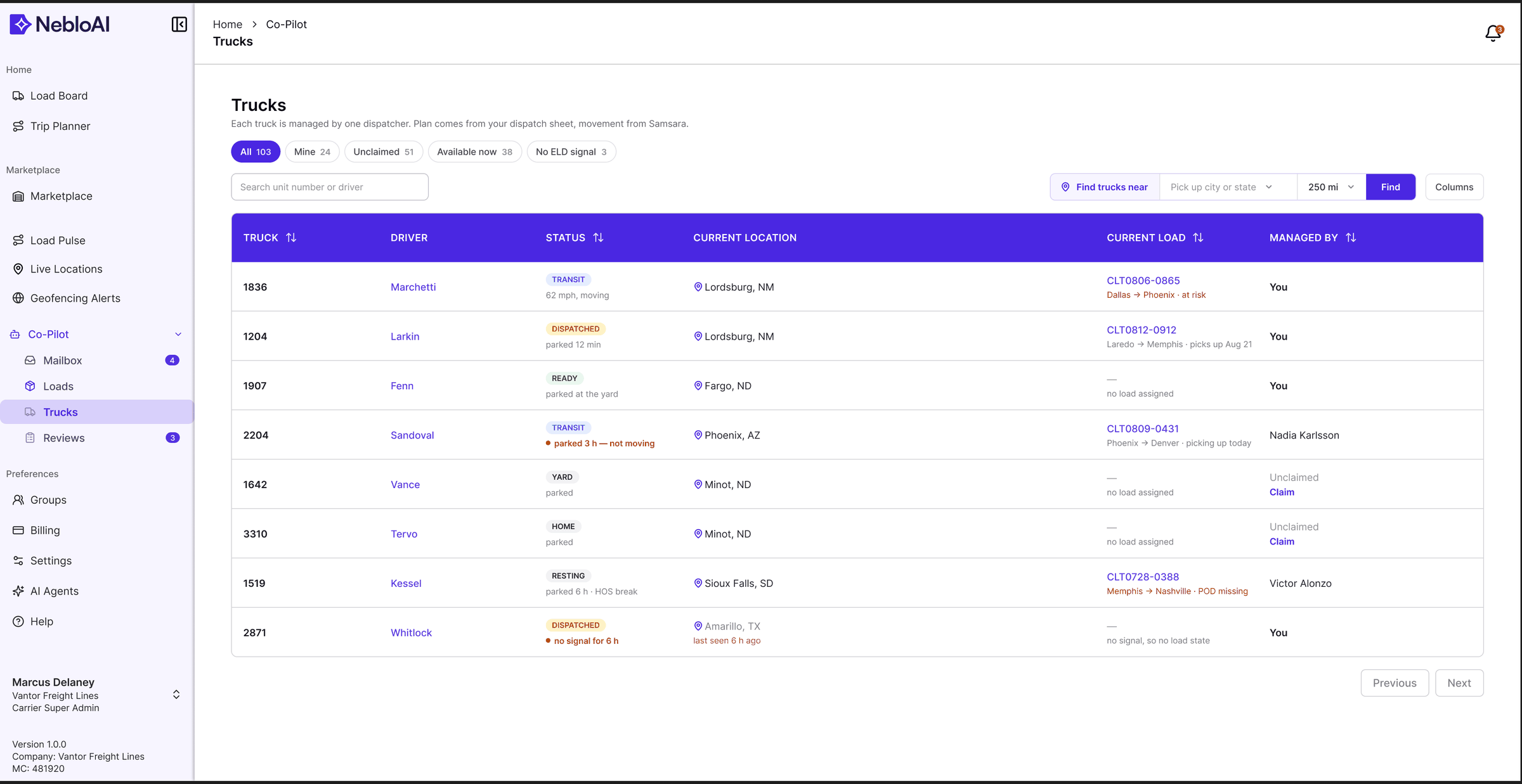
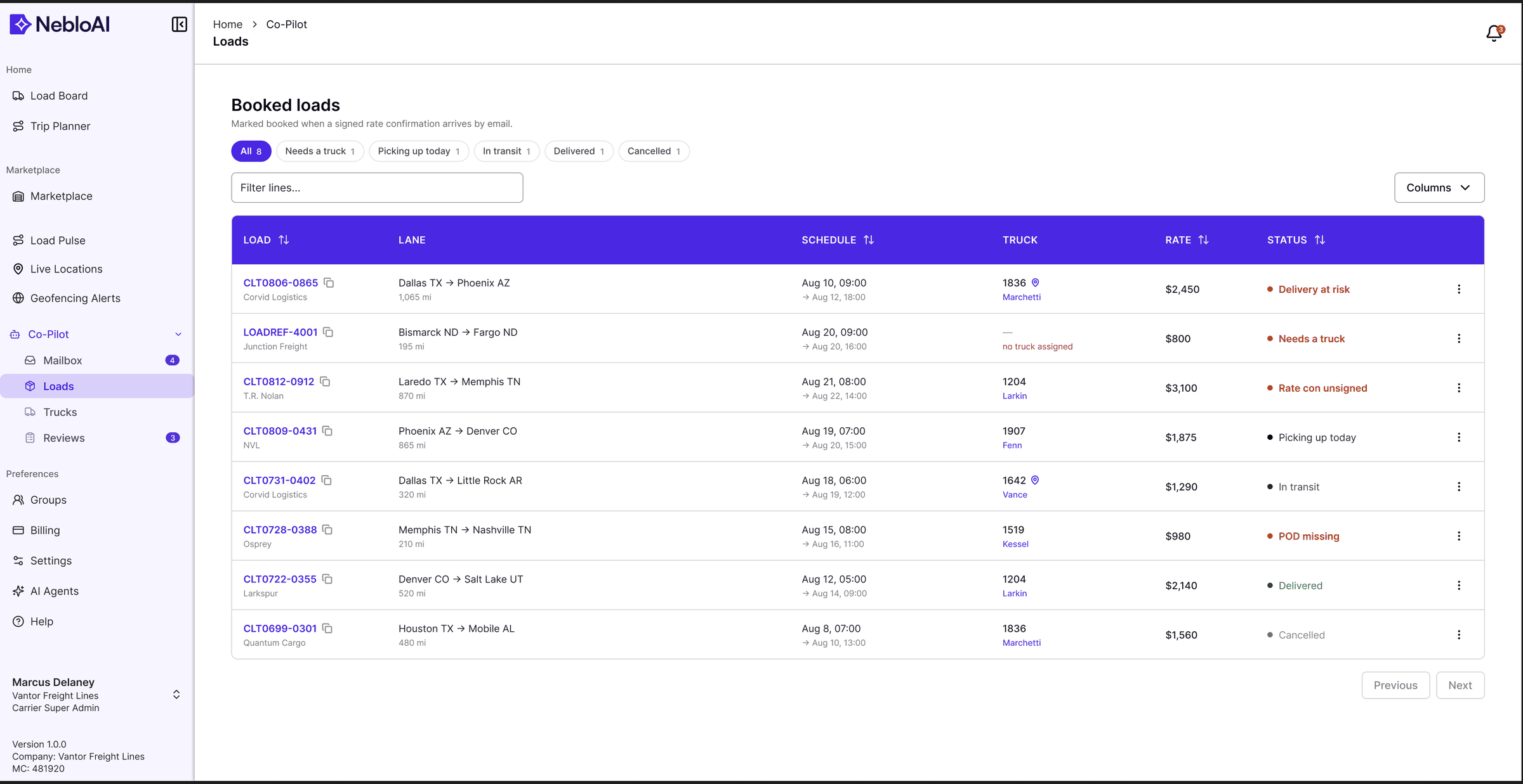
Colour does a job. Purple is the brand: table headers, links and the active filter. In the loads table, one warning colour marks every load that needs a person (a delivery at risk, no truck, an unsigned rate con, a missing POD), green marks delivered and grey marks cancelled.
- Colors/Primary-Purple/50#f7f5ff
- Colors/Primary-Purple/100#d8d0fb
- Colors/Primary-Purple/200#b1a2f6
- Colors/Primary-Purple/300#8c75f0
- Colors/Primary-Purple/500#4a27e2
- Colors/Primary-Purple/800#1f1254
- Colors/Emerald/50#ecfdf5
- Colors/Emerald/600#059669
- Colors/Emerald/800#065f46
- Colors/Blue/50#eff6ff
- Colors/Blue/600#2563eb
- Colors/Gray/50#f9fafb
- Colors/Gray/800#1f2937
- Colors/Base/White#ffffff
- background/medium/warning#e0601f
- stroke/warning#e0601f
- content/on-bold/default#ffffffe3
- Base/foreground
var(--foreground)#080614 - Base/background
var(--background)#ffffff - Base/border/border
var(--border)#d4d4d8 - Base/input
var(--input)#a1a1aa - Base/muted/muted-foreground
var(--muted-foreground)#27272a - Sidebar/background
var(--sidebar-background)#f7f5ff - Sidebar/foreground
var(--sidebar-foreground)#27272a - Sidebar/foreground-70%
var(--sidebar-foreground)/70#27272ab2
- font-family/heading Inter
- text-xs 12
- text-sm 14
- text-base 16
- font-weight/font-normal 400
- font-weight/font-medium 500
- font-weight/font-semibold 600
- text-base/font-semiBold
- text-sm/font-semiBold
- text-sm/font-medium
- text-sm/font-regular
- text-xs/font-medium
- text-xs/font-regular
- Radius/TailwindCSS/rounded-sm4
- Radius/Component/radius-button6
- Radius/Component/radius-input6
- Radius/Component/radius-iconButton6
- Radius/TailwindCSS/rounded-lg8
- Gap/gap-14
- Spacing/spacing-2xs4
- Gap/gap-28
- Padding/p-28
- Spacing/spacing-sm8
- Spacing/spacing-md12
- Padding/p-416
- Spacing/spacing-lg16
- Spacing/input-size-container-md40
- Size/size-button-sm36
- Size/size-button-md40
- Size/size-input-md40
- Dimensions/00
- Dimensions/416
- Opacity/disabled50
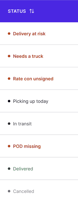



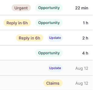

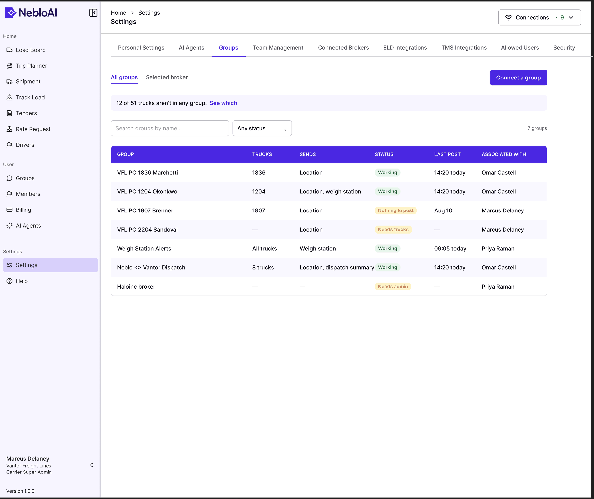
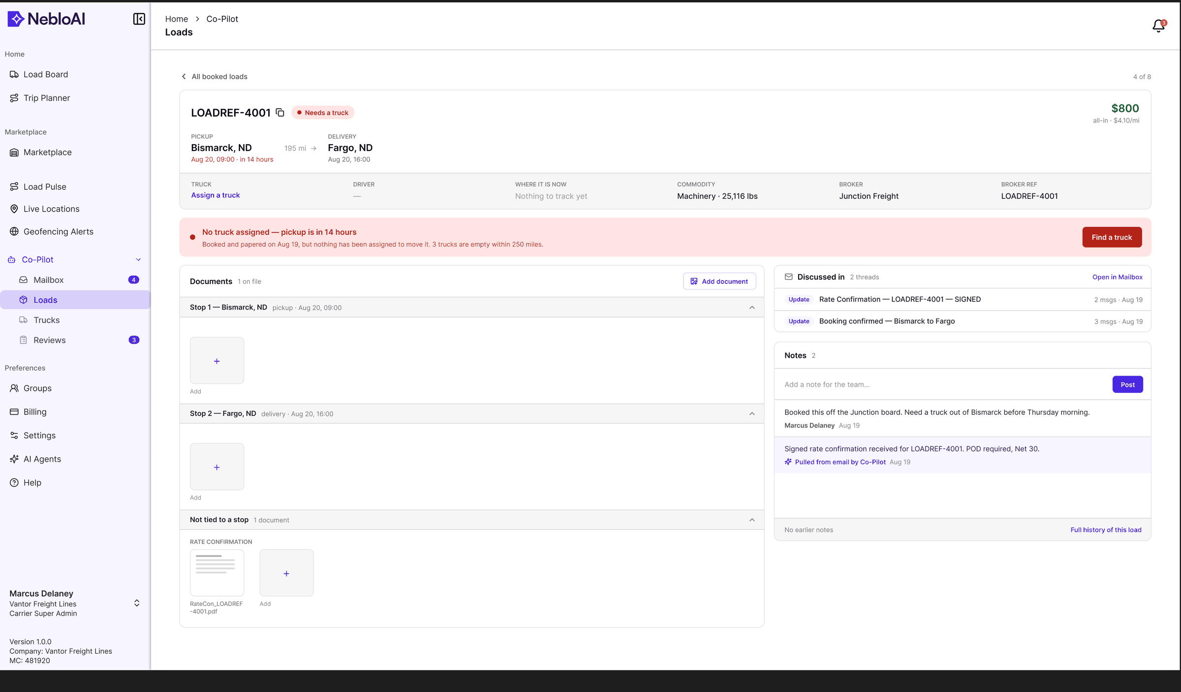
Frames named for the state they show.
On a small team, handoff couldn't be a ceremony. Each area of the product has its own section in the Figma file, with frames numbered and named for the state they show, so an engineer can open one section and see every state before building it.
- L1 · Loads — booked
- L5 · Load detail — documents by stop
- L6 · Load detail — no truck assigned
- L5a · Load detail — documents as a list
- L7 · Find a truck — drawer
- AL1 · Alerts — all
- AL2 · Alerts — Geofences tab
- AL2b · Alerts — Departures tab
- AL2c · Alerts — Red Zone tab
- AL3 · Alerts — New alert chooser
- AL4 · Alerts — Red Zone editor
- AL5 · Alerts — Geofence editor (wide, with map)
- AL6 · Alerts — Departure editor
- AL7 · Alerts — a reminder that couldn’t post (list)
- AL7a · Alerts — a reminder that couldn’t post (opened)
- AL8 · New geofence — nothing placed yet
- AL8a · New geofence — circle placed
- AL8b · New geofence — states or cities
- AL9 · New departure reminder
- AL10 · Red Zone tab — not set up yet
Where the work landed.
Customer figures stay private, so this section covers what changed in the product: the team has a shared structure for how AI, operations, and roles fit together, and screens that hold up in development conversations.
Clearer product structure
The team now works from a shared model of how AI assistance, operational truth, and three user roles fit together.
Workflow direction for core loops
Broker and carrier interactions follow one continuous flow from search through negotiation to delivery.
Dashboard clarity for decisions
Operational views lead with status and next actions; density is available on demand rather than by default.
Faster product discussions
Dev-ready Figma flows keep product and engineering conversations concrete instead of hypothetical.
What I would improve next.
These are the threads I would have pulled on next.
- 01Usability testing sessions with working brokers, on their own loads
- 02More edge states for negotiation — expiry mid-counter, simultaneous counters, withdrawn offers
- 03Mobile responsiveness, starting with the carrier portal
- 04Deeper analytics review once real usage data accumulates
- 05Design system expansion as the integration module set grows